5.1 Beginning at the end
The approach we’ll use in this Chapter will be to start off by showing you a figure which we suggest is at a standard that you could use in a poster or presentation. Using that as the aim, we will then work towards it step-by-step. You should not view this final figure as any sort of holy grail. For instance, you would be very unlikely to use this in a publication (you’d be much more likely to use some results from your hard earned-analysis). Regardless, this “final figure” is, and will only ever be, a reflection of what our personal preferences are. As with anything subjective, you may well disagree, and to some extent we hope you do. Much better that we all have slightly (or grossly) different views on what a good figure is - otherwise we may as well go back to using cookie-cutter figures.
So what’s the figure we’re going to make together?
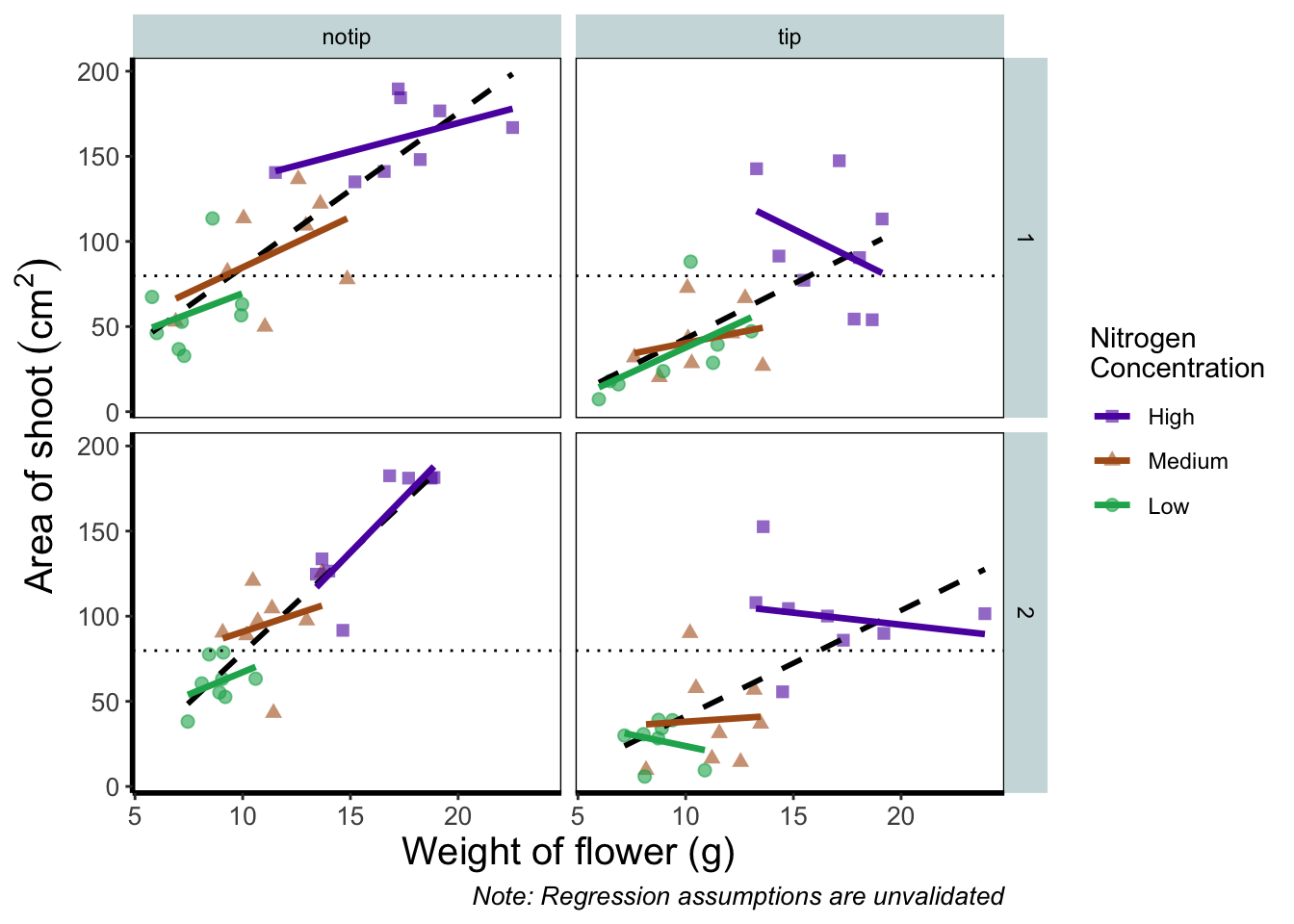
Before we go further, let’s take a second and talk about what this figure is showing. On the y axes of the four plots we have the surface area of flower shoots, and on the x axes we have the weight of the flowers. Each column of plots shows whether the tip of the flower was removed (notip) or retained (tip). Each row of plots identifies which experimental block in the greenhouse the plants were grown in, either ‘block 1’ or ‘block 2’.
The different coloured and shaped points within each plot represents plants grown at three nitrogen concentrations. These colours are used to distinguish which points correspond to a certain nitrogen concentration. For example, data points coloured green were plants grown in low nitrogen concentrations, brown in medium nitrogen and purple in high concentrations.
We have also added four trend lines to each plot (using a linear model, see Chapter 6). The three solid coloured lines show the relationship between shoot area and weight of the flower according to which nitrogen treatment and block the plants were grown. The dashed black line in each plot represents the relationship between shoot area and flower weight whilst ignoring any nitrogen affect.
Finally, the thin grey dotted line on each plot represents the overall mean shoot area regardless of the weight of the flowers, the nitrogen concentration or the block.
For the purposes of this Chapter, we won’t worry about the biology here. Do not take this as standard practice, you should absolutely care deeply about the science in your own data. It’s the science that should be the driving force behind the questions you ask, which in turn determines what figures you should make.