5.3 Tips and tricks
For this section we’ll use various versions of the final figure without including the facet_grid(). We do so only to allow the changes to be more apparent. With this plot, we’ll run through some tips and tricks that we wish we’d learnt when we started using ggplot2.
5.3.1 Statistics layer
The statistics layer is often ignored in favour of working solely with the geometry layer, as we’ve done above. The two are largely interchangeable, though the relative rareness of online help and discussions on the statistics layer seems to have relegated it to almost a state of anonymity. There is real value in at least understanding what the statistics layer is doing, even if you don’t ever need to make direct use of it. It is perhaps most clear what the statistical layer is doing in the early geom_smooth() figure we made.
ggplot(aes(x = weight, y = shootarea), data = flower) +
  geom_point() +
  geom_smooth(method = "lm", se = FALSE)
## `geom_smooth()` using formula = 'y ~ x'
Nowhere in our dataset are there columns for either the y-intercept or the gradient needed to draw the straight line, yet we’ve managed to draw one. The statistics layer calculates these based on our data, without us necessarily knowing what we’ve done. It’s also the engine behind converting your data into counts for producing a bar chart, or densities for violin plots, or summary statistics for boxplots and so on.
It’s entirely possible that you’ll be able to use ggplot2 for the vast majority of you plotting without ever consulting the statistics layer in any more detail than we have here (simply by “calling” - unknowingly - to it via the geometry layer), but be aware that it exists.
If we wanted to recreate the above figure using the statistics layer we would do it like this:

ggplot(aes(x = weight, y = shootarea), data = flower) +
  geom_point() +
    # using stat_smooth instead of geom_smooth
  stat_smooth(geom = "smooth", method = "lm", se = FALSE)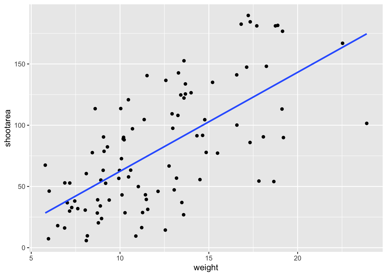
While in this example it doesn’t make a difference which we use, in other cases we may want to use the calculated statistics in alternative ways. We won’t get into it, but see ?after_stat if you are interested.
5.3.2 Axis limits and zooms
Fairly often, you may want to limit the range of your axes. Maybe you want to focus a particular part of the data to really tease apart any patterns occurring there. Whatever the reason, it’s a useful skill, and with most things code related, there’s a couple of ways to do this. We’ll show two here; xlim() and ylim(), and coord_cartesian(). Using both of these we’ll set the x axis to only show data between 10 and 15 g and the y axis to only show the area of the shoot between 50 and 150 mm2. We’ll start with limiting the axes:

ggplot(aes(x = weight, y = shootarea), data = flower) +
    geom_point(aes(colour = nitrogen, shape = nitrogen), size = 2, alpha = 0.6) +
    geom_smooth(colour = "black", method = "lm", se = FALSE, linetype = 2, alpha = 0.6) +
    geom_smooth(aes(colour = nitrogen), method = "lm", se = FALSE, size = 1.2) +
    xlab("Weight of flower (g)") +
    ylab(bquote("Area of shoot"~(cm^2))) +
    geom_hline(aes(yintercept = 79.7833), size = 0.5, colour = "black", linetype = 3) +
    labs(shape = "Nitrogen\nConcentration", colour = "Nitrogen\nConcentration",
             caption = "Regression assumptions are unvalidated") +
    scale_colour_manual(values = c("#5C1AAE", "#AE5C1A", "#1AAE5C"),
         labels = c("High", "Medium", "Low")) +
    scale_shape_manual(values = c(15,17,19,21),
         labels = c("High", "Medium", "Low")) +
    theme_rbook() +
    # New x and y limits
    xlim(c(10, 15)) +
    ylim(c(50, 150))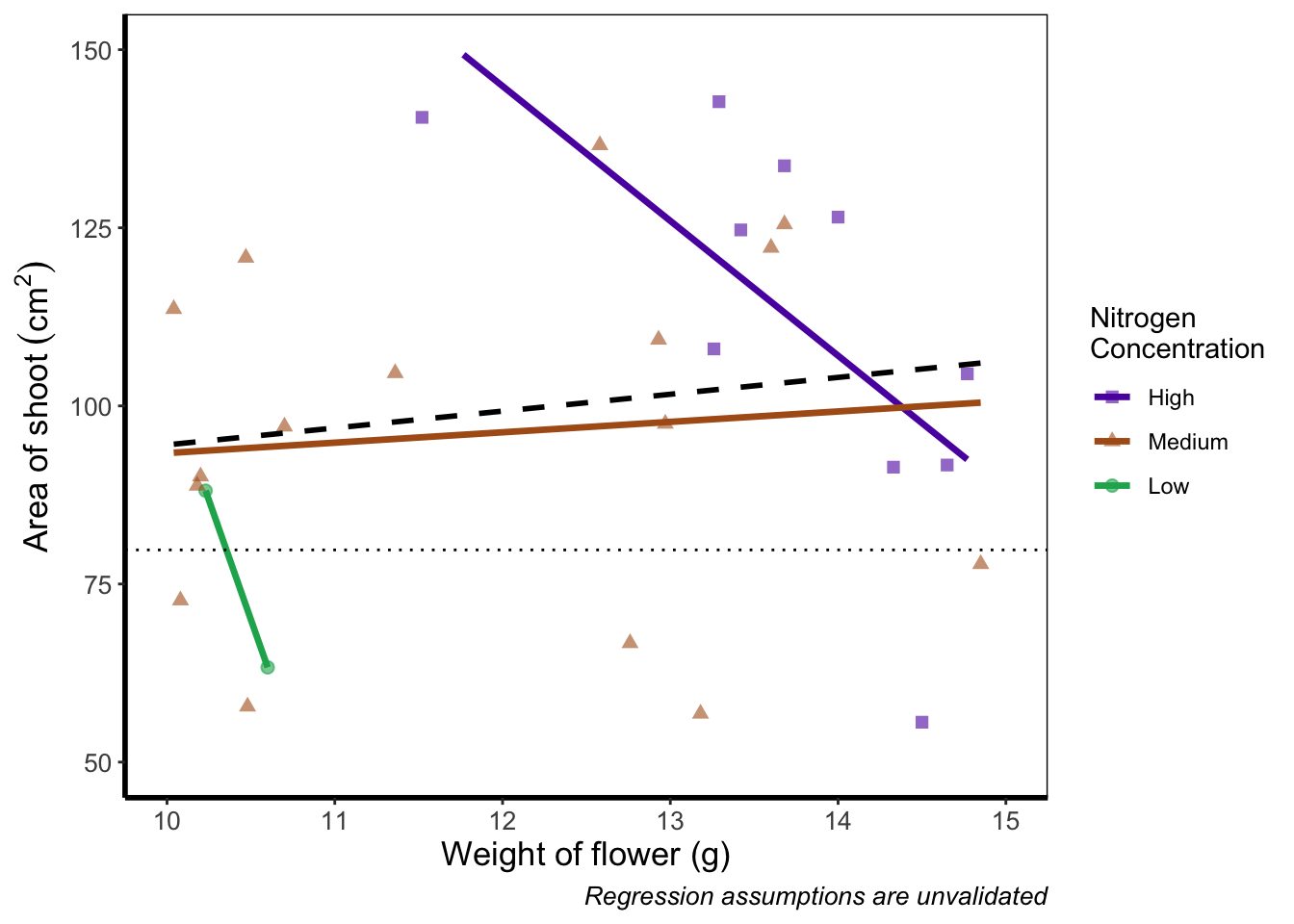
If you run this yourself you’ll see warning messages telling us that n rows contain either missing or non-finite values. That’s because we’ve essentially chopped out a huge part of our data using this method (everything outside of the ranges that we specified is “removed” from the data). As a result of doing this our lines have now completely changed direction. Notice that for low nitrogen concentration, the line is being drawn using only two points? This may, or may not be a problem depending on the aim we have, but we can use an alternative method; coord_cartesian().
coord_cartesian() works in much the same way, but instead of chopping out data, it instead zooms in. Doing so means that the entire dataset is maintained (and any trends are maintained).
ggplot(aes(x = weight, y = shootarea), data = flower) +
    geom_point(aes(colour = nitrogen, shape = nitrogen), size = 2, alpha = 0.6) +
    geom_smooth(colour = "black", method = "lm", se = FALSE, linetype = 2, alpha = 0.6) +
    geom_smooth(aes(colour = nitrogen), method = "lm", se = FALSE, size = 1.2) +
    xlab("Weight of flower (g)") +
    ylab(bquote("Area of shoot"~(cm^2))) +
    geom_hline(aes(yintercept = 79.7833), size = 0.5, colour = "black", linetype = 3) +
    labs(shape = "Nitrogen\nConcentration", colour = "Nitrogen\nConcentration",
             caption = "Regression assumptions are unvalidated") +
    scale_colour_manual(values = c("#5C1AAE", "#AE5C1A", "#1AAE5C"),
       labels = c("High", "Medium", "Low")) +
    scale_shape_manual(values = c(15,17,19,21),
       labels = c("High", "Medium", "Low")) +
    theme_rbook() +
    # Zooming in rather than chopping out
    coord_cartesian(xlim = c(10, 15),   ylim = c(50, 150))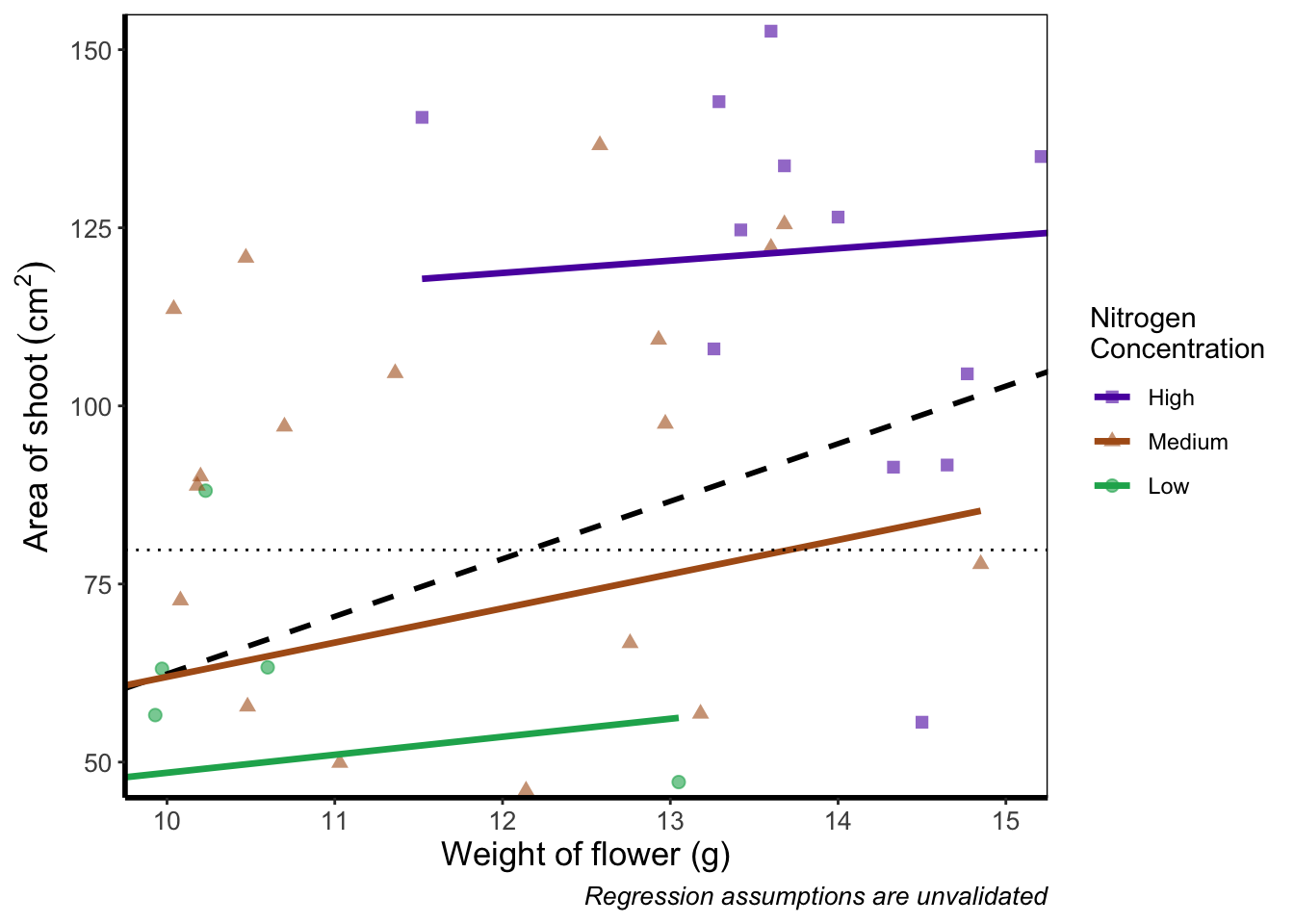
Notice now that the trends are maintained (as the lines are being informed by data which are off-screen). We would generally advise using coord_cartesian() as it protects you against possible misinterpretations.
5.3.3 Layering layers
Remember that ggplot2 works like painting. Let’s imagine we were one of the great renaissance painters. We’ve just finished the focal point of our painting, the half naked Duke of Toulouse looking moody or something. Now that we’ve finished painting the honourable Duke, we proceed to paint the background, a beautiful landscape showing the Pyrenees mountains in the distance. Unfortunately, in doing so we’ve painted over the Duke because the order of our layers was wrong. We get our heads chopped off, but learn a valuable lesson in the process: the order of layers matter.
The exact same is true in ggplot2 (minus the chopping off of heads, though your situation may vary). The layers are read and “painted” in order of their appearance in the code. If geom_point() comes before geom_col(), then your points may well end up being hidden. To fix this is easy, we simply need to move the layers up or down in the code. A useful tip for those using RStudio, is that you can move lines of code especially easily. Simply click on a line of code, hold down Alt and then press either the up or down arrows, and the entire line will move up or down as well. For multiple lines of code, simply highlight all those lines you want to move and press Alt + Up/Down arrow.
We’ll move both the points and the overall black dashed line down in the code so that they are superimposed over the nitrogen lines:
ggplot(aes(x = weight, y = shootarea), data = flower) +
    geom_smooth(aes(colour = nitrogen), method = "lm", se = FALSE, size = 1.2) +
    # Move one line down
    geom_point(aes(colour = nitrogen, shape = nitrogen), size = 2, alpha = 0.6) +
    geom_smooth(colour = "black", method = "lm", se = FALSE, linetype = 2, alpha = 0.6) +
    xlab("Weight of flower (g)") +
    ylab(bquote("Area of shoot"~(cm^2))) +
    geom_hline(aes(yintercept = 79.7833), size = 0.5, colour = "black", linetype = 3) +
    labs(shape = "Nitrogen\nConcentration", colour = "Nitrogen\nConcentration",
             caption = "Regression assumptions are unvalidated") +
    scale_colour_manual(values = c("#5C1AAE", "#AE5C1A", "#1AAE5C"),
       labels = c("High", "Medium", "Low")) +
    scale_shape_manual(values = c(15,17,19,21),
       labels = c("High", "Medium", "Low")) +
    theme_rbook()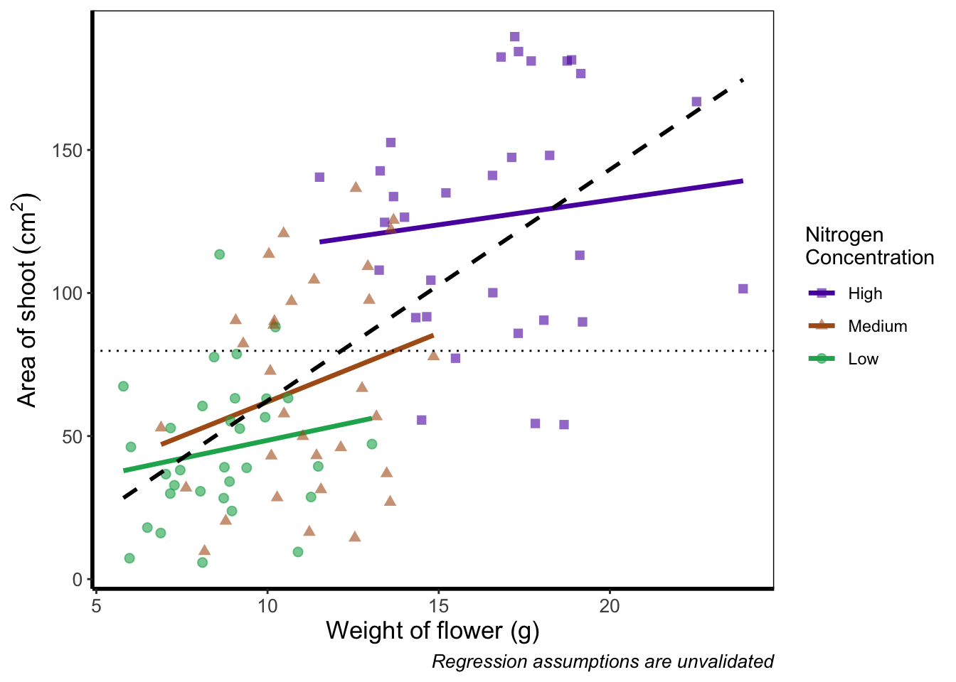
It’s not the clearest example, but give it a shot with your own data.
5.3.4 Continuous colours
Instead of categorical colours, such as we’ve used for nitrogen concentration, what if instead we wanted a gradient? To illustrate this, we’ll remove the trend lines to highlight the changes we make. We’ll also be using the flowers variable (i.e. number of flowers) to specify the colour that points should be coloured. We have three options that we’ll use here; the default colour scheme, the scale_colour_gradient() scheme, and an alternative schemescale_colour_gradient2(). Remember that we’ll also need to change our label for the legend.
We’ll start with the default option. Here we only need to change nitrogen (which is a factor) to flowers (which is continuous) in the colour = argument within aes():

ggplot(aes(x = weight, y = shootarea), data = flower) +
    # Deleted geom_smooths for illustrative purposes only
  # (and also removed alpha argument from geom_point)
    geom_point(aes(colour = flowers, shape = nitrogen), size = 2) +
    xlab("Weight of flower (g)") +
    ylab(bquote("Area of shoot"~(cm^2))) +
    geom_hline(aes(yintercept = 79.7833), size = 0.5, colour = "black", linetype = 3) +
    # Changed colour argument label
    labs(shape = "Nitrogen\nConcentration", colour = "Number of\nFlowers",
             caption = "Regression assumptions are unvalidated") +
    scale_shape_manual(values = c(15,17,19,21),
       labels = c("High", "Medium", "Low")) +
    theme_rbook()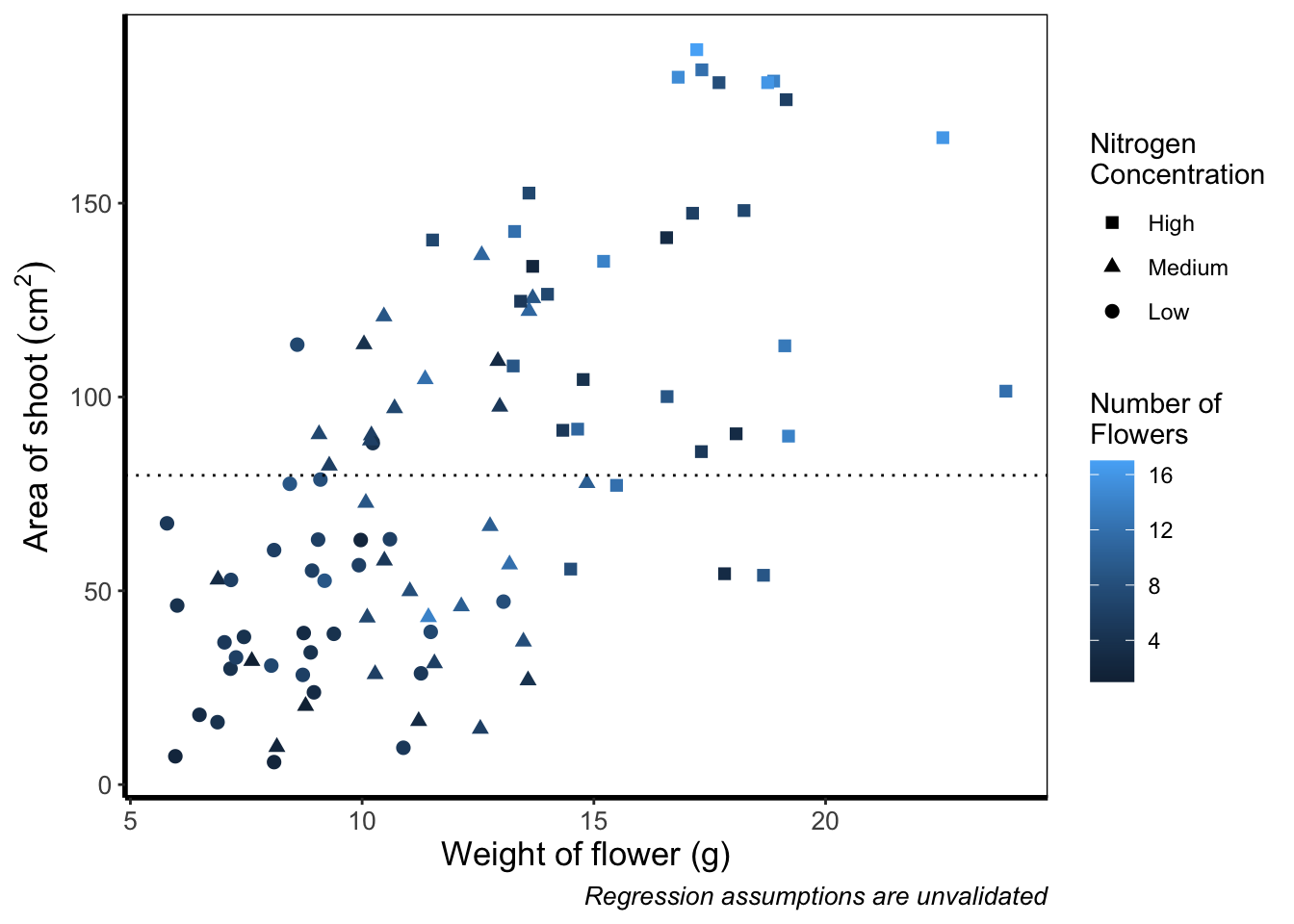
And as easily as that we have a colour gradient to show number of flowers. Dark blue shows low flower numbers and light blue shows higher flower numbers. While the code has worked, we have a hard time distinguishing between the different shades of blue. It would help ourselves (and our audience), if we changed the colours to something more noticeably different, using scale_colour_gradient(). This works much as scale_colour_manual() except that this time we specify the low = and high = values using arguments.
ggplot(aes(x = weight, y = shootarea), data = flower) +
    geom_point(aes(colour = flowers, shape = nitrogen), size = 2) +
    xlab("Weight of flower (g)") +
    ylab(bquote("Area of shoot"~(cm^2))) +
    geom_hline(aes(yintercept = 79.7833), size = 0.5, colour = "black", linetype = 3) +
    # Updated legend name for colour
    labs(shape = "Nitrogen\nConcentration", colour = "Number of\nFlowers",
             caption = "Regression assumptions are unvalidated") +
    scale_shape_manual(values = c(15,17,19,21),
       labels = c("High", "Medium", "Low")) +
    # Adding scale_colour_gradient
    scale_colour_gradient(low = "#9F00FF", high = "#FF9F00") +
    theme_rbook()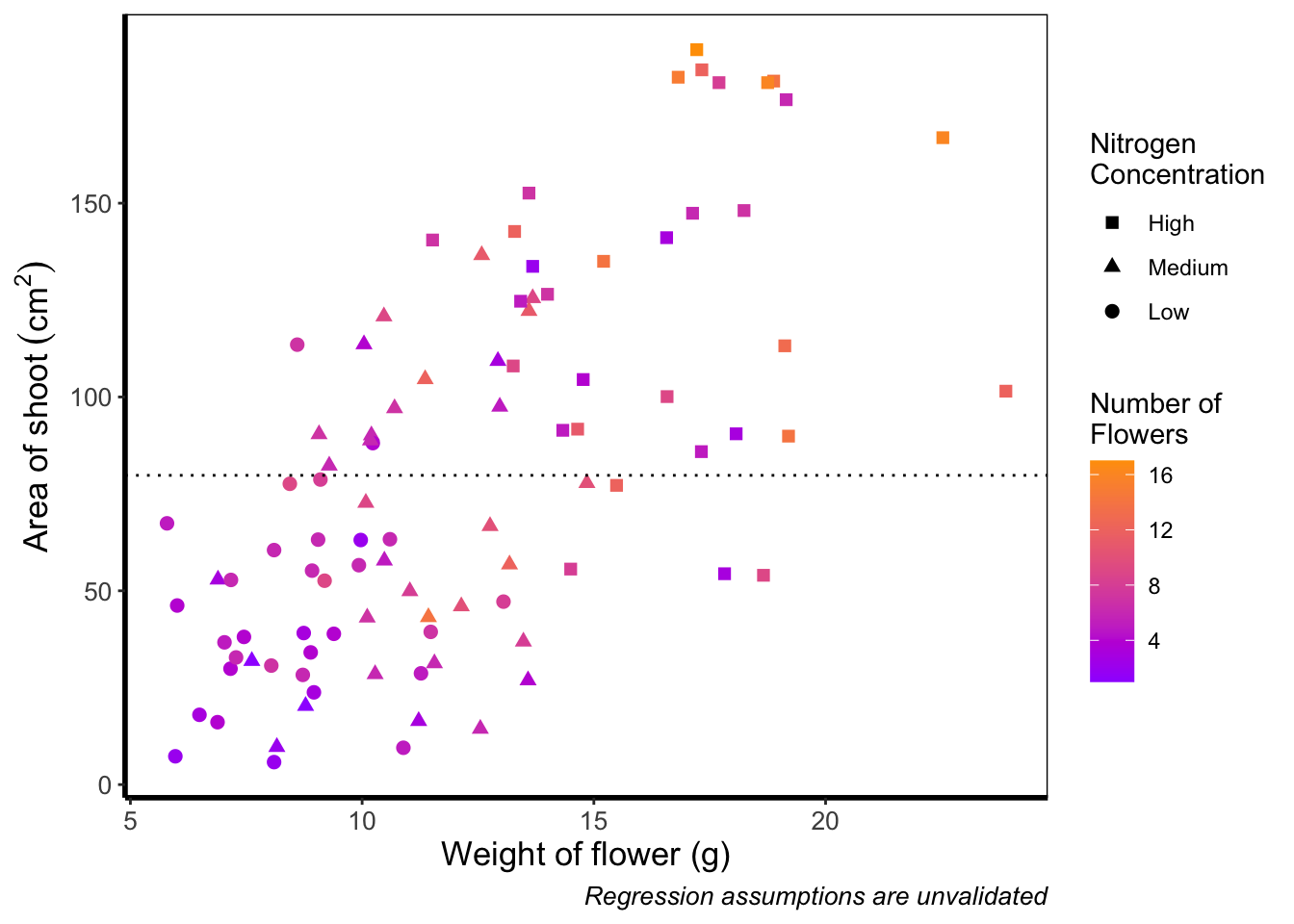
Although arguably better, we still struggle to spot the difference when there are between 5 and 12 flowers. Maybe having an additional colour would help those mid values stand out a bit more. The way we can do that here is to set a midpoint where the colours shift from green to blue to pink. Doing so might help us see the variation even more clearly. This is exactly what scale_colour_gradient2() allows. scale_colour_gradient2() works in much the same way as scale_colour_gradient() except that we have two additional arguments to worry about; midpoint = where we specify a value for the midpoint, and mid = where we state the colour the midpoint should take. We’ll set the midpoint using mean().
ggplot(aes(x = weight, y = shootarea), data = flower) +
    geom_point(aes(colour = flowers, shape = nitrogen), size = 2) +
    xlab("Weight of flower (g)") +
    ylab(bquote("Area of shoot"~(cm^2))) +
    geom_hline(aes(yintercept = 79.7833), size = 0.5, colour = "black", linetype = 3) +
    labs(shape = "Nitrogen\nConcentration", colour = "Number of\nFlowers",
             caption = "Regression assumptions are unvalidated") +
    scale_shape_manual(values = c(15,17,19,21),
       labels = c("High", "Medium", "Low")) +
    # Adding scale_colour_gradient2
    scale_colour_gradient2(midpoint = mean(flower$flowers),
       low = "#9F00FF", mid = "#00FF9F", high = "#FF9F00") +
    theme_rbook()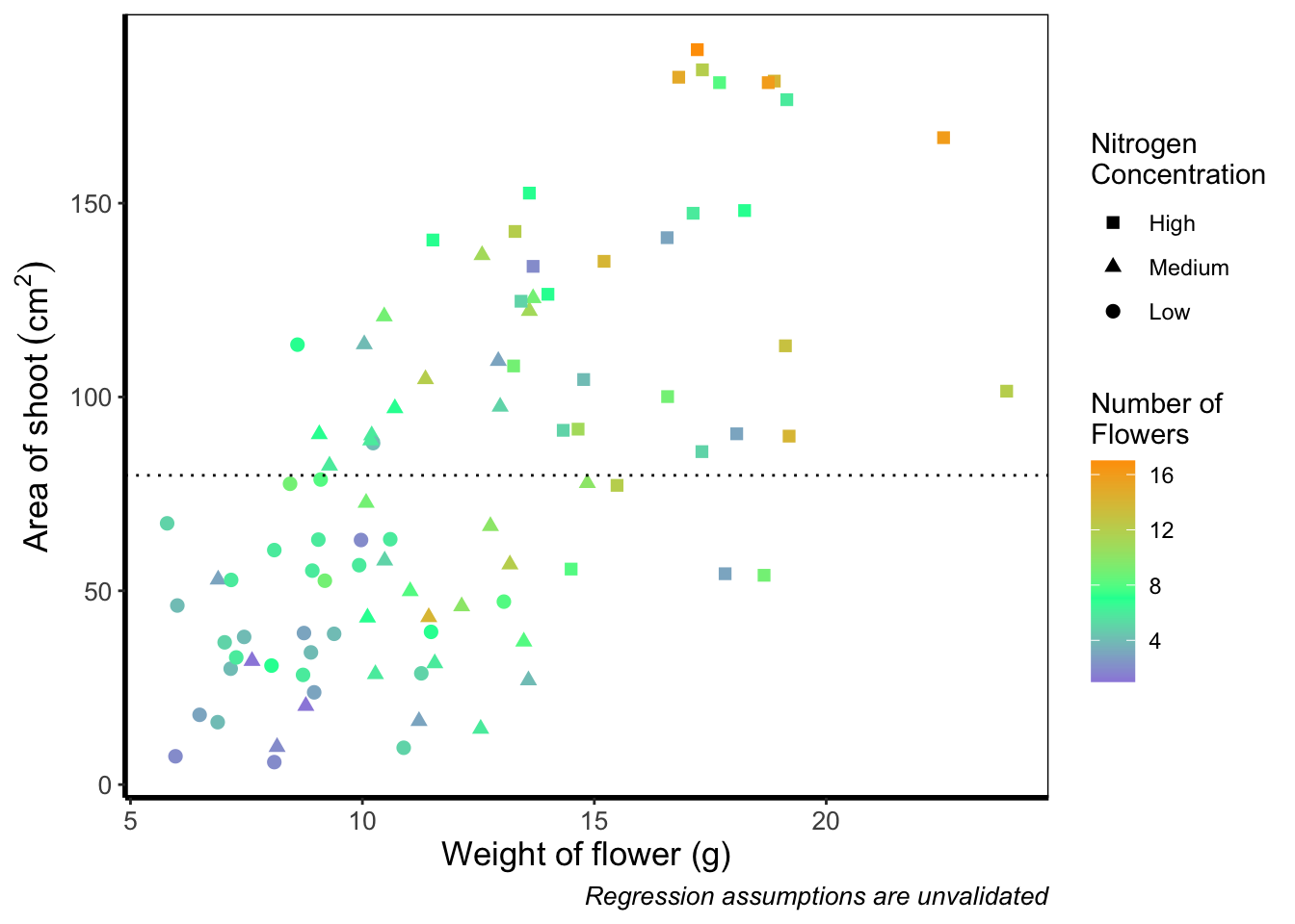
Definitely not our favourite figure. Perhaps if we add more colours, that will help things a bit (probably not but let’s do it anyway). We now move onto using scale_colour_gradientn(), which diverges slightly. Instead of specifying colours for low, mid, and/or high, here we’ll be specifying them using proportions within the values = argument. A common mistake with values =, within scale_colour_gradient(), is to assume (justifiably in our opinion) that we’d specify the actual numbers of flowers as our values. This is wrong. Try doing so and you’ll likely see a grey colour bar and grey points. Instead values = represent the proportional ranges where we want the colour to occupy. In the code below, we use 0, 0.25, 0.5, 0.75 and 1 as our proportions, corresponding to 4 colours (note that we have one fewer colour than proportions given as the colours occupy a range and not a value).
ggplot(aes(x = weight, y = shootarea), data = flower) +
    geom_point(aes(colour = flowers, shape = nitrogen), size = 2) +
    xlab("Weight of flower (g)") +
    ylab(bquote("Area of shoot"~(cm^2))) +
    geom_hline(aes(yintercept = 79.7833), size = 0.5, colour = "black", linetype = 3) +
    labs(shape = "Nitrogen\nConcentration", colour = "Number of\nFlowers",
             caption = "Regression assumptions are unvalidated") +
    scale_shape_manual(values = c(15,17,19,21),
       labels = c("High", "Medium", "Low")) +
    # Adding scale_colour_gradientn
    scale_colour_gradientn(colours = c("#1252ED", "#12ED3F", "#EDAD12", "#ED12C0"),
       values = c(0, 0.25, 0.5, 0.75, 1)) +
    theme_rbook()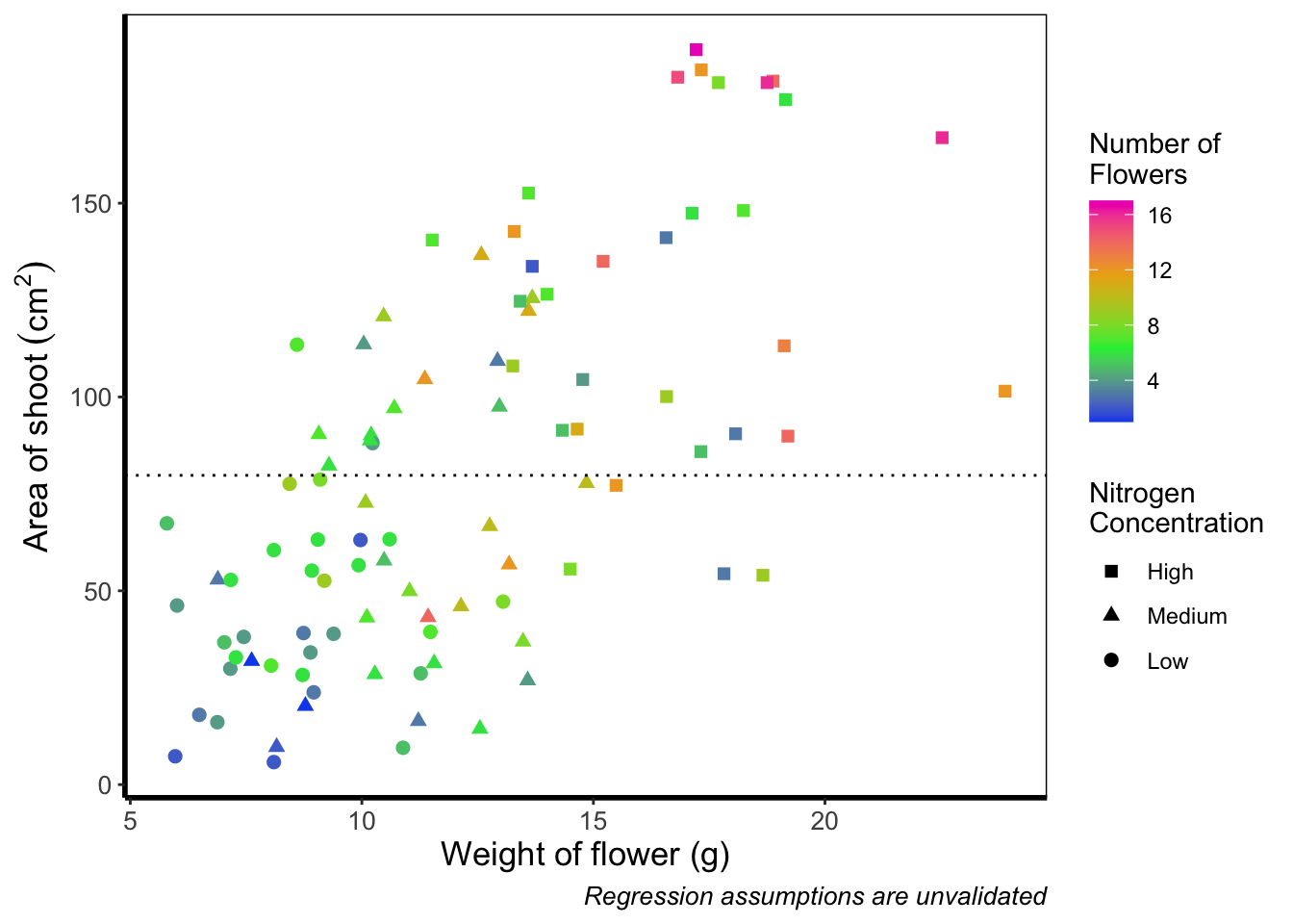
Slightly nauseating but it’s doing what we wanted it to do, so we shouldn’t really complain.
5.3.5 Size of points
Previously, we altered to size of points to be a constant number (e.g. size = 2). What if instead we wanted size to change according to a variable in our dataset? We can do this very easily by including a continuous variable with the size = argument.

ggplot(aes(x = weight, y = shootarea), data = flower) +
    # Moving size into aes and changing to a continuous variable
    geom_point(aes(colour = nitrogen, shape = nitrogen, size = height), alpha = 0.6) +
    geom_smooth(colour = "black", method = "lm", se = FALSE, linetype = 2, alpha = 0.6) +
    geom_smooth(aes(colour = nitrogen), method = "lm", se = FALSE, size = 1.2) +
    xlab("Weight of flower (g)") +
    ylab(bquote("Area of shoot"~(cm^2))) +
    geom_hline(aes(yintercept = 79.7833), size = 0.5, colour = "black", linetype = 3) +
    # Including size label
    labs(shape = "Nitrogen\nConcentration", colour = "Nitrogen\nConcentration",
             caption = "Regression assumptions are unvalidated",
             size = "Plant\nHeight (cm)") +
    scale_colour_manual(values = c("#5C1AAE", "#AE5C1A", "#1AAE5C"),
       labels = c("High", "Medium", "Low")) +
    scale_shape_manual(values = c(15,17,19,21),
       labels = c("High", "Medium", "Low")) +
    theme_rbook()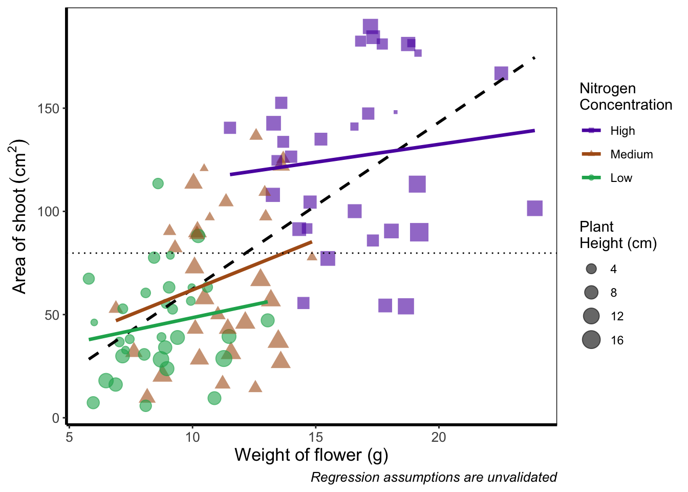
Now the sizes reflect the height of the plants, with bigger points representing taller plants and vice-versa.
5.3.6 Moving the legend
To move the position of the legend requires tweaking the theme, just as we did before with theme_rbook(). But for legends we might not want this to be set in stone whenever we use the theme (i.e. coding this into theme_rbook()). Instead we can change it on the fly depending on the individual figure. To do so, we can use a theme() layer and the argument legend.position =, followed swiftly by another layer specifying that we still want to use theme_rbook().

ggplot(aes(x = weight, y = shootarea, colour = nitrogen), data = flower) +
    geom_point(aes(shape = nitrogen), size = 2, alpha = 0.6) +
    geom_smooth(method = "lm", se = FALSE) +
    geom_smooth(method = "lm", se = FALSE, linetype = 2, alpha = 0.6, colour = "black") +
    xlab("Weight of flower (g)") +
    ylab(bquote("Area of shoot"~(cm^2))) +
    labs(shape = "Nitrogen\nConcentration", colour = "Nitrogen\nConcentration",
             caption = "Regression assumptions are unvalidated") +
    geom_hline(aes(yintercept = 79.8), size = 0.5, colour = "black", linetype = 3) +
    scale_colour_manual(values = c("#5C1AAE", "#AE5C1A", "#1AAE5C"),
       labels = c("High", "Medium", "Low")) +
    scale_shape_manual(values = c(15,17,19),
       labels = c("High", "Medium", "Low")) +
    # Moving the legend
    theme(legend.position = "bottom") +
    theme_rbook()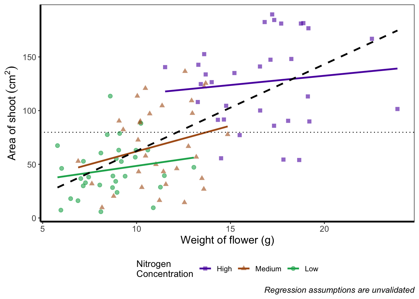
Play around: Try the code above but don’t include theme_rbook() and see what happens? What about if you try theme_rbook(legend.position = "bottom")?
5.3.7 Hiding the legend
Suppose we don’t want a legend at all. How would we go about hiding it?
ggplot(aes(x = weight, y = shootarea, colour = nitrogen), data = flower) +
    geom_point(aes(shape = nitrogen), size = 2, alpha = 0.6) +
    geom_smooth(method = "lm", se = FALSE) +
    geom_smooth(method = "lm", se = FALSE, linetype = 2, alpha = 0.6, colour = "black") +
    xlab("Weight of flower (g)") +
    ylab(bquote("Area of shoot"~(cm^2))) +
    labs(shape = "Nitrogen\nConcentration", colour = "Nitrogen\nConcentration",
             caption = "Regression assumptions are unvalidated") +
    geom_hline(aes(yintercept = 79.8), size = 0.5, colour = "black", linetype = 3) +
    scale_colour_manual(values = c("#5C1AAE", "#AE5C1A", "#1AAE5C"),
       labels = c("High", "Medium", "Low")) +
    scale_shape_manual(values = c(15,17,19),
       labels = c("High", "Medium", "Low")) +
    # Hiding the legend
    theme(legend.position = "none") +
    theme_rbook()
5.3.8 Hiding part of the legend
What if we really don’t want points included in the legend? Instead of stating this using theme(), we’ll include it within geom_point() using show.legend = FALSE.
ggplot(aes(x = weight, y = shootarea, colour = nitrogen), data = flower) +
    # Including show.legend = FALSE to prevent inclusion in legend
    geom_point(aes(shape = nitrogen), size = 2, alpha = 0.6, show.legend = FALSE) +
    geom_smooth(method = "lm", se = FALSE) +
    geom_smooth(method = "lm", se = FALSE, linetype = 2, alpha = 0.6, colour = "black") +
    xlab("Weight of flower (g)") +
    ylab(bquote("Area of shoot"~(cm^2))) +
    labs(shape = "Nitrogen\nConcentration", colour = "Nitrogen\nConcentration",
             caption = "Regression assumptions are unvalidated") +
    geom_hline(aes(yintercept = 79.8), size = 0.5, colour = "black", linetype = 3) +
    scale_colour_manual(values = c("#5C1AAE", "#AE5C1A", "#1AAE5C"),
       labels = c("High", "Medium", "Low")) +
    scale_shape_manual(values = c(15,17,19),
       labels = c("High", "Medium", "Low")) +
    theme_rbook()
5.3.9 Writing on a figure
What if we were so utterly proud of our figure that we wanted to sign it (just like a painter signs their works of art)? We can do this using geom_text(). If we want to change the font, we need to check which ones are available for us to use. We can check this by running windowsFonts(). We’ll use Times New Roman in this example, which is referred to as serif.
Not happy with your font options? Check out the extrafont package which expands your ‘fontage’.

ggplot(aes(x = weight, y = shootarea, colour = nitrogen), data = flower) +
    geom_point(aes(shape = nitrogen), size = 2, alpha = 0.6) +
    geom_smooth(method = "lm", se = FALSE) +
    geom_smooth(method = "lm", se = FALSE, linetype = 2, alpha = 0.6, colour = "black") +
    xlab("Weight of flower (g)") +
    ylab(bquote("Area of shoot"~(cm^2))) +
    labs(shape = "Nitrogen\nConcentration", colour = "Nitrogen\nConcentration",
             caption = "Regression assumptions are unvalidated") +
    geom_hline(aes(yintercept = 79.8), size = 0.5, colour = "black", linetype = 3) +
    scale_colour_manual(values = c("#5C1AAE", "#AE5C1A", "#1AAE5C"),
       labels = c("High", "Medium", "Low")) +
    scale_shape_manual(values = c(15,17,19),
       labels = c("High", "Medium", "Low")) +
    # Including layer to display text
    geom_text(x = 22, y = 5, label = "A. Artist", colour = "grey", family = "serif") +
    theme_rbook()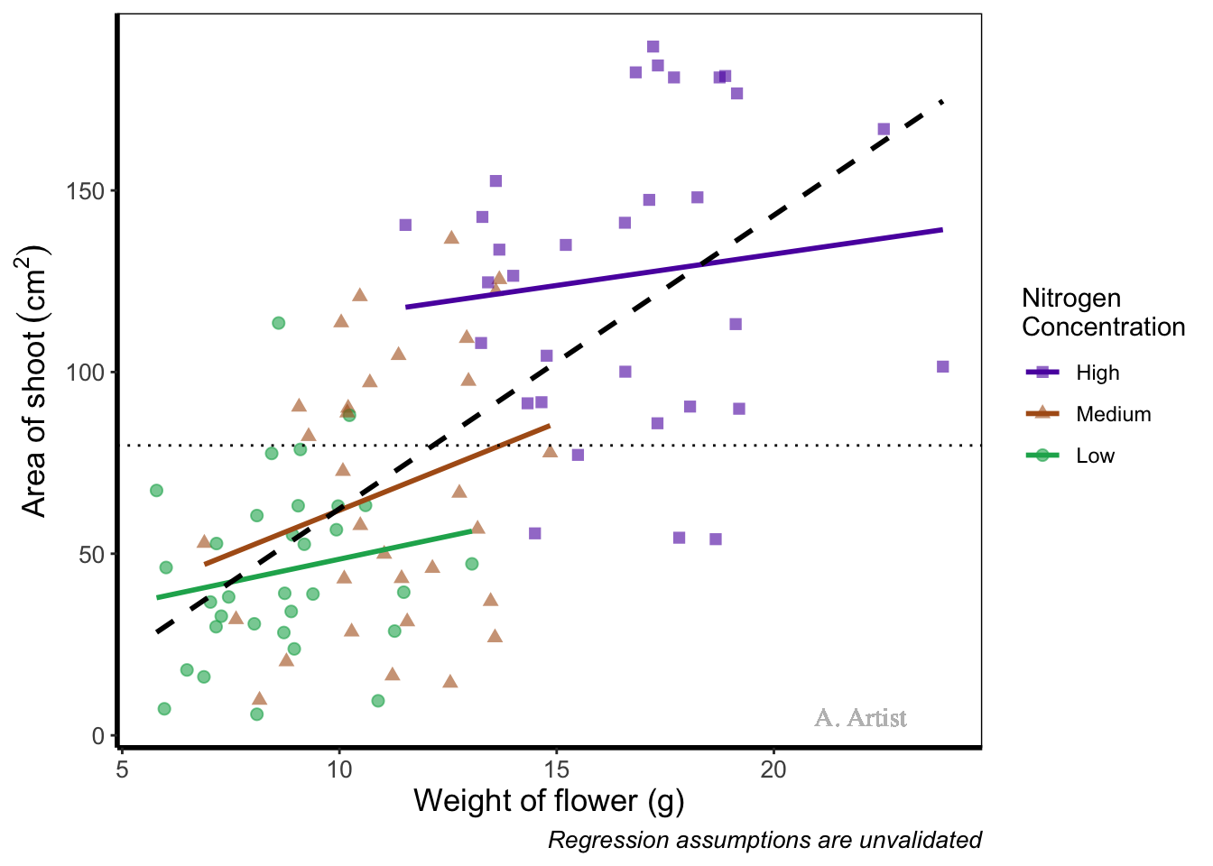
In reality there are more appropriate uses for geom_text() but whatever the reason, the mechanics remain the same. We specify what the x and y position are (on the scale of the axes), what we want written (using label =), the font (using family =). If you want to do more complex tasks with text and labels, check out ggrepel which extends the options available to you.
Similarly, if we want to include a tag for the figure, for instance we may want to refer to this figure as A we can do this using an additional argument in labs(). Let’s see how that works:
ggplot(aes(x = weight, y = shootarea, colour = nitrogen), data = flower) +
    geom_point(aes(shape = nitrogen), size = 2, alpha = 0.6) +
    geom_smooth(method = "lm", se = FALSE) +
    geom_smooth(method = "lm", se = FALSE, linetype = 2, alpha = 0.6, colour = "black") +
    xlab("Weight of flower (g)") +
    ylab(bquote("Area of shoot"~(cm^2))) +
    # Including tag argument
    labs(shape = "Nitrogen\nConcentration", colour = "Nitrogen\nConcentration",
             caption = "Regression assumptions are unvalidated", tag = "A") +
    geom_hline(aes(yintercept = 79.8), size = 0.5, colour = "black", linetype = 3) +
    scale_colour_manual(values = c("#5C1AAE", "#AE5C1A", "#1AAE5C"),
       labels = c("High", "Medium", "Low")) +
    scale_shape_manual(values = c(15,17,19),
       labels = c("High", "Medium", "Low")) +
    theme_rbook()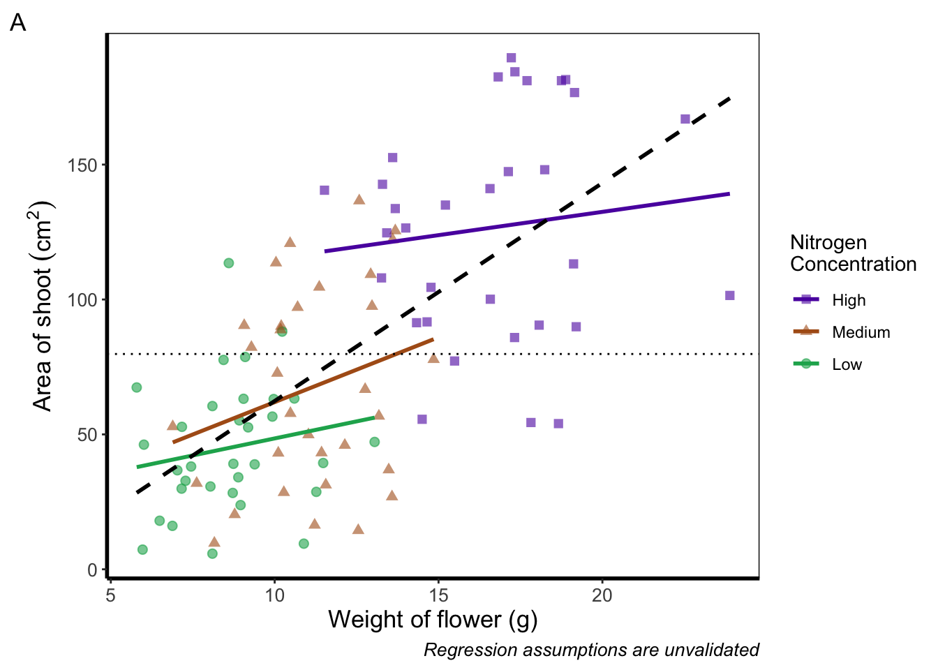
Doing so we get an “A” at the top left of the figure. If we weren’t happy with the position of the “A”, we can always use geom_text() instead and position it ourselves.
5.3.10 Axes tick marks and tick labels
What are we to do if we want more or fewer ticks on an axis? We can do this using the appropriate layers; scale_y_discrete() and scale_x_discrete() for discrete data (e.g. factors); and scale_y_continuous() and scale_x_continuous() for continuous data. Within these layers, the argument we want to use is called breaks =, though we need to use this in combination with seq() (see Chapter 2 for a reminder on how the seq() function works). We’ll alter the x axis ticks in this example, with a tick label every 2.5 units.
ggplot(aes(x = weight, y = shootarea, colour = nitrogen), data = flower) +
    geom_point(aes(shape = nitrogen), size = 2, alpha = 0.6) +
    geom_smooth(method = "lm", se = FALSE) +
    geom_smooth(method = "lm", se = FALSE, linetype = 2, alpha = 0.6, colour = "black") +
    xlab("Weight of flower (g)") +
    ylab(bquote("Area of shoot"~(cm^2))) +
    labs(shape = "Nitrogen\nConcentration", colour = "Nitrogen\nConcentration",
             caption = "Regression assumptions are unvalidated") +
    geom_hline(aes(yintercept = 79.8), size = 0.5, colour = "black", linetype = 3) +
    scale_colour_manual(values = c("#5C1AAE", "#AE5C1A", "#1AAE5C"),
       labels = c("High", "Medium", "Low")) +
    scale_shape_manual(values = c(15,17,19),
       labels = c("High", "Medium", "Low")) +
    # Adjusting breaks on x axis
    scale_x_continuous(breaks = seq(from = 5, to = 25, by = 2.5)) +
    theme_rbook()
Axis tick labels sometimes need to be rotated. If you’ve ever worked with data from multiple species (with those lovely long latin names) for example, you’ll know that it can be a nightmare making figures. The names can end up overlapping to such an extent that your axis tick labels merge into a giant black blob of unreadable abstractionism. In such cases it’s best to rotate the text to make it readable. Doing so isn’t too much of a pain and we’ll be using theme() again to set the text angle to 45 degrees in addition to a little vertical adjustment so that the text doesn’t get too close or run too far away from the axis.
ggplot(aes(x = weight, y = shootarea, colour = nitrogen), data = flower) +
    geom_point(aes(shape = nitrogen), size = 2, alpha = 0.6) +
    geom_smooth(method = "lm", se = FALSE) +
    geom_smooth(method = "lm", se = FALSE, linetype = 2, alpha = 0.6, colour = "black") +
    xlab("Weight of flower (g)") +
    ylab(bquote("Area of shoot"~(cm^2))) +
    labs(shape = "Nitrogen\nConcentration", colour = "Nitrogen\nConcentration",
             caption = "Regression assumptions are unvalidated") +
    geom_hline(aes(yintercept = 79.8), size = 0.5, colour = "black", linetype = 3) +
    scale_colour_manual(values = c("#5C1AAE", "#AE5C1A", "#1AAE5C"),
       labels = c("High", "Medium", "Low")) +
    scale_shape_manual(values = c(15,17,19),
       labels = c("High", "Medium", "Low")) +
    # Changing the angle of the axis text
    theme(axis.text.x=element_text(angle = 45, vjust = 0.5)) +
    theme_rbook()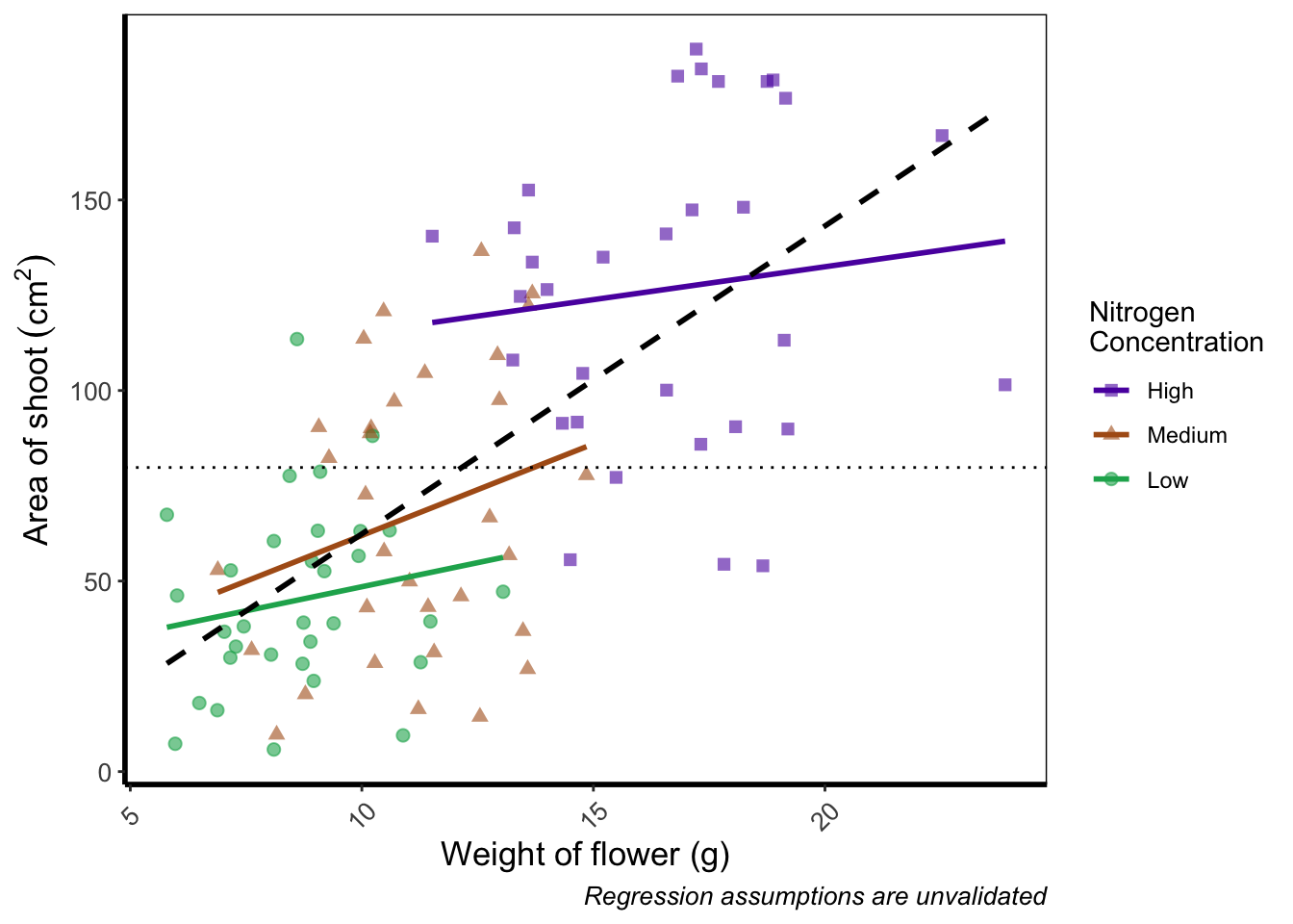
Phew. Now we can really read those numbers. Granted, rotating the axis text here isn’t needed, but keep this trick in mind if you have lots of levels in a factor which leads to illegible blobs.
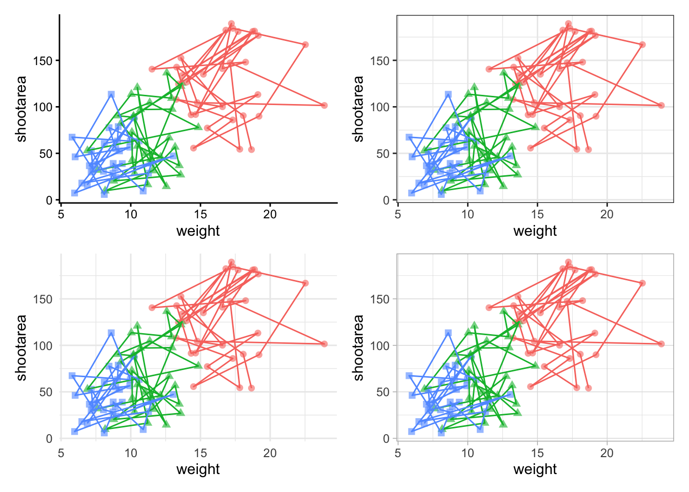
5.3.11 More advanced patchwork
When we used patchwork previously, we used the basics of the package to create nested figures. There are more advanced features which we’ll quickly go through here.
As a precursor, we’ll generate four simple scatterplots each with one of the four different themes used earlier and assign the nested figure the name nested_1. We’ll use the patchwork operator + to link them all together and see how that looks.
a <- ggplot(aes(x = weight, y = shootarea, colour = nitrogen), data = flower) +
    geom_point(aes(shape = nitrogen), size = 2, alpha = 0.6) +
    theme_classic()

b <- ggplot(aes(x = weight, y = shootarea, colour = nitrogen), data = flower) +
    geom_point(aes(shape = nitrogen), size = 2, alpha = 0.6) +
    theme_bw()

c <- ggplot(aes(x = weight, y = shootarea, colour = nitrogen), data = flower) +
    geom_point(aes(shape = nitrogen), size = 2, alpha = 0.6) +
    theme_minimal()

d <- ggplot(aes(x = weight, y = shootarea, colour = nitrogen), data = flower) +
    geom_point(aes(shape = nitrogen), size = 2, alpha = 0.6) +
    theme_light()

nested_1 <- a + b + c +d

nested_1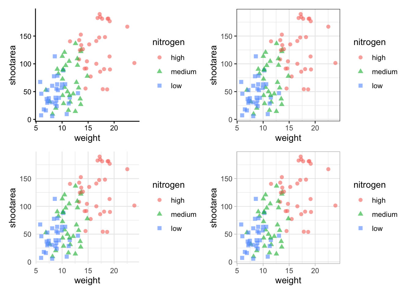
The problem with this figure is that we’re using a lot of space to get legends squeezed into the middle. We can solve that by using the plot_layout() function and collecting the guides together:
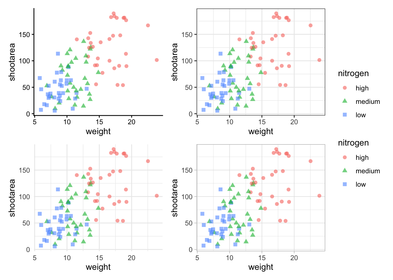
Looks a bit tidier, though in this case say we want to remove the legends entirely. Note that to do this we use a new operator, the ampersand (&). When we use the & operator in patchwork, we add ggplot2 elements to all plots within patchwork. To show how you can use patchwork and ggplot2 together, we’ll also add in an additional geom_path() to all plots, while simultaneously removing the legends.
To change the layout of the figure we can use the plot_layout() function to specify a design. We’ll start by creating a layout to use, which we call grid_layout using A, B, C, D to represent plots a, b, c and d (we could have called the plots anything we wanted to). We’ll arrange it so that the four graphs surround an empty white space in the centre of the plotting space. Each plot will either be five units wide or five unites tall.
grid_layout <- "
AAAAA
B###C
B###C
B###C
B###C
B###C
DDDDD
"

nested_1 +
    plot_layout(design = grid_layout) &
    theme(legend.position = 'none')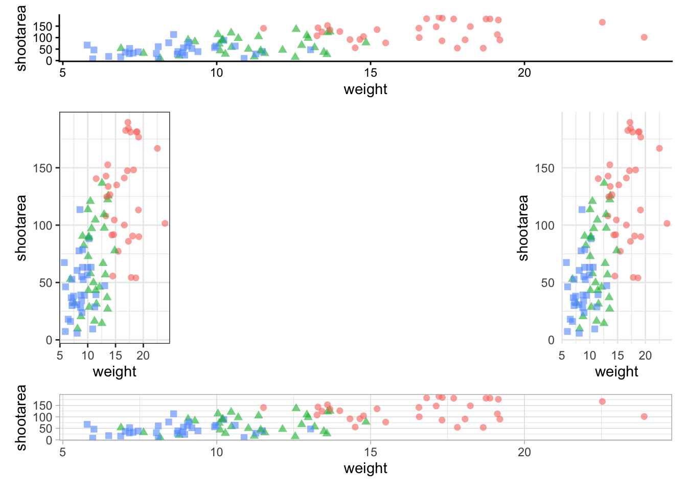
To round off this Chapter, we’ll take you on a whistle-stop tour of some of the common types of plots you can make in the aptly named “ggplot bestiary section”.