Chapter 5 Graphics with ggplot
For many people, using R to create informative and pretty figures is one of the more rewarding aspects of using R. These can either take the form of a rough and ready plot to get a feel for what’s going on in your data, or a fancier, more complex figure to use in a publication or a report. This process is often as close as many scientists get to having a professional creative side (at least that’s true for us), and it’s a source of pride for some folk.
As mentioned in the Introduction, one of the many reasons for the rise in the popularity of R is its ability to produce publication quality figures. Not only can R users make figures well suited for publication, but the means in which the figures are produced also offers a wide-range of customisation. This in turn allows users to create their own particular styles and brands of figures which are well beyond the cookie-cutter styles in more traditional point and click software. Because of this inherent flexibility when producing figures, data visualisation in R and supporting packages has grown substantially over the years.
In this Chapter, we will focus on creating figures using a specialised package called ggplot2.
Before we get going with making some plots of the gg variety, how about a quick history of one of the most commonly used packages in R? ggplot2 was based on a book called Grammar of Graphics by Leland Wilkinson (hence the gg in ggplot2), yours for only £100 or so. But before you spend all that money, see here for an interesting summary of Wilkinson’s book.
The Grammar of Graphics approach moves away from the idea that to create, for example, a scatterplot, users should click the scatterplot button or use the scatterplot() function. Instead, by breaking figures down into their various components (e.g. the underlying statistics, the geometric arrangement, the theme, see Fig. 5.1), users will be able to manipulate each of these components (i.e. layers) and produce a tailor-made figure fit for their specific needs. Contrast this approach with the one used by, for example, Microsoft Excel. The user specifies the data and then clicks the scatterplot button. This inherently locks the user into many choices made by the software developer and not the user. Think of how easily you can spot an Excel scatterplot because other than a couple of pre-set options, there’s really not much you can do to change the way the plot displays the data - you are at the mercy of the [insert corporation here] Gods.
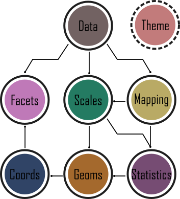
Figure 5.1: framework behind ggplot2
While Wilkinson would eventually go on to become vice-president of SPSS, his (and his oft forgotten co-author’s) ideas would, never-the-less, make their way into R via ggplot2 as well as other implementations (e.g. tableau).
In 2007 ggplot2 was released by Hadley Wickham. By 2017 the package had reportedly been downloaded 10 million times and over the last few years ggplot2 has become the foundation for numerous other packages which expand its functionality even more. ggplot2 is now part of the tidyverse collection of R packages.
It’s important to note that ggplot2 is not required to make “fancy” and informative figures in R. If you prefer using base R graphics then feel free to continue as almost all ggplot2 type figures can be created using base R (we often use either approach depending on what we’re doing). The difference betweenggplot2 and base R is how you get to the end product rather than any substantial differences in the end product itself. This is, never-the-less, a common belief probably due to the fact that making a moderately attractive figure is (in our opinion at least), easier to do with ggplot2 as many aesthetic decisions are made for the user, without you necessarily even knowing that a decision was ever made!
With that in mind, let’s get started making some figures.